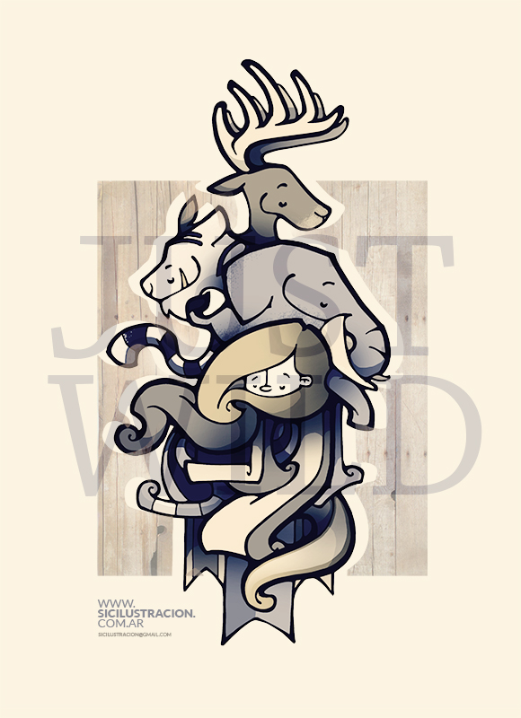
I’m sure you have in your travels come across the classic minimalist Penguin classic covers
Well, a number of the classic reads have had a bit of a face-lift thanks to a group of designers and Aids awareness fund (RED) teaming up with the book publisher Penguin books


Dracula designed by Non-Format

The Secret Agent designed by Coralie Bickford-Smith (Penguin Press art department)

Notes From Underground designed by Gray318 (Jon Gray)
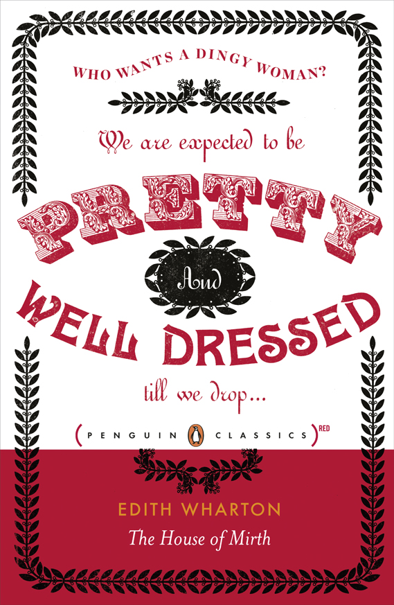

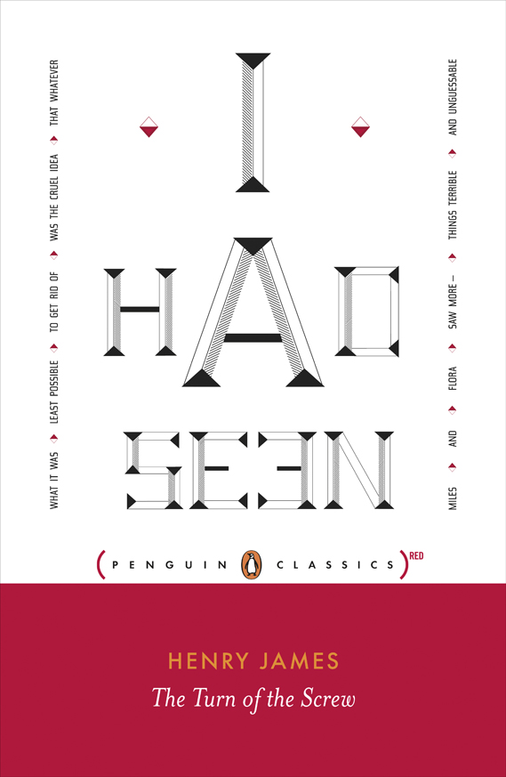
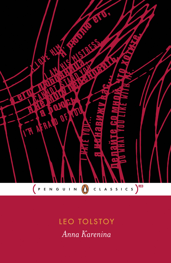

I found these originally posted at the ever-inspiring creative review


constantly i used to read smaller content that also clear their motive, and that is also
happening with this post which I am reading at
this place.
I will right away take hold of your rss as I can not in finding your email subscription hyperlink or newsletter service.
Do you’ve any? Kindly permit me recognise so that I could subscribe.
Thanks.
Hi mates, how is everything, and what you desire to say on the topic of this
paragraph, in my view its actually remarkable designed for me.
Excellent, what a weblog it is! This website presents useful data to us, keep it
up.
Have you ever considered writing an e-book or guest authoring on other websites? I have a blog based on the same topics you discuss and would really like to have you share some stories/information. I know my visitors would value your work. If you are even remotely interested, feel free to send me an e-mail.
It is appropriate time to make some plans for the future and it is time to be happy.
I have read this post and if I could I want to suggest you few interesting things or suggestions.
Maybe you could write next articles referring to this article.
I wish to read even more things about it!
Hiya! I know this is kinda off topic however I’d figured I’d ask.
Would you be interested in trading links or maybe guest authoring a blog article or
vice-versa? My site goes over a lot of the same topics as yours and
I feel we could greatly benefit from each other. If you’re interested
feel free to send me an email. I look forward to hearing from you!
Excellent blog by the way!
What are the very best web sites as well as blog sites devoted to analysis as well as literature?
First off I want to say awesome blog! I had a quick question that
I’d like to ask if you don’t mind. I was interested to find out how you center yourself and
clear your thoughts before writing. I have
had trouble clearing my mind in getting my ideas out.
I do enjoy writing but it just seems like the first 10 to
15 minutes are lost just trying to figure out how to
begin. Any ideas or tips? Thanks!
Hi, I do think this is a great blog. I stumbledupon it ;) I will revisit yet again since i have saved
as a favorite it. Money and freedom is the best way to change, may you be rich and continue to help other people.
I’m not sure where you are getting your information, but great
topic. I needs to spend some time learning more or understanding
more. Thanks for wonderful information I was looking for this info for my mission.
Your style is unique compared to other folks I have read
stuff from. Thank you for posting when you have the opportunity,
Guess I’ll just book mark this web site.
My spouse and I stumbled over here coming from a different web address
and thought I may as well check things out. I like what I see so now i am following you.
Look forward to looking over your web page repeatedly.
I think this is one of the most significant
info for me. And i’m glad reading your article.
But should remark on few general things, The website style is
great, the articles is really excellent : D. Good job,
cheers
auto like, Increase Likes, ZFN Liker, Status Auto Liker, autolike, Autolike International, Photo Liker, Auto Like, Auto Liker, Autoliker, Photo Auto Liker, Working Auto Liker, Autolike, autoliker, Autoliker, auto liker, Status Liker
It’s very effortless to find out any matter on web as compared to textbooks,
as I found this piece of writing at this web site.
With havin so much written content do you ever run into any problems
of plagorism or copyright infringement? My site has a lot of completely unique content I’ve either created
myself or outsourced but it seems a lot of it
is popping it up all over the web without my authorization. Do you know any solutions to help stop content
from being ripped off? I’d certainly appreciate it.
please stop by the web pages we comply with, like this a single, as it represents our picks through the web
When I originally commented I appear to have clicked the -Notify me when new
comments are added- checkbox and now each time a comment is added I recieve 4 emails with the exact same comment.
Is there a means you are able to remove me from that service?
Kudos!
Hi there! I could have sworn I’ve visited this blog before but after
browsing through some of the posts I realized it’s new to
me. Anyhow, I’m definitely happy I found it and
I’ll be book-marking it and checking back regularly!
Hi it’s me, I am also visiting this web page on a regular basis,
this web site is actually pleasant and the visitors are actually sharing fastidious thoughts.
I read this piece of writing fully regarding the resemblance of newest and previous
technologies, it’s amazing article.
Do you mind if I quote a couple of your posts as long as I provide
credit and sources back to your site? My blog is in the very same niche as yours and my visitors would truly benefit
from a lot of the information you present here. Please let
me know if this okay with you. Many thanks!
Finnish: Tämä on arvokas sisältö!
Can I just say what a relief to get someone that actually understands just what theyre speaking about on the net. You certainly know how to bring an issue to light and make it important. More people must check this out and appreciate this side of the story. I find it difficult to imagine you’re not more popular since you definitely possess the gift.
It is appropriate time to make some plans for the future and it’s time to be happy.
I’ve read this post and if I could I desire to suggest you some interesting things or suggestions.
Maybe you can write next articles referring to this article.
I wish to read more things about it!
I am genuinely grateful to the holder of this website
who has shared this impressive post at here.
Hey I know this is off topic but I was wondering if you knew of any widgets I could add to my blog that automatically tweet my newest twitter updates. I’ve been looking for a plug-in like this for quite some time and was hoping maybe you would have some experience with something like this. Please let me know if you run into anything. I truly enjoy reading your blog and I look forward to your new updates.
Here are some of the internet sites we advise for our visitors
Lao: ?????????????????????????!
A personSomeoneSomebody necessarilyessentially lend a handhelpassist to make seriouslycriticallysignificantlyseverely articlesposts I wouldI mightI’d state. This isThat is the firstvery first time I frequented your web pagewebsite page and to this pointso farthus farup to now? I amazedsurprised with the researchanalysis you made to createmake this actualthis particular postsubmitpublishput up incredibleamazingextraordinary. GreatWonderfulFantasticMagnificentExcellent taskprocessactivityjob!
PrettyVery greatnice post. I simplyjust stumbled upon your blogweblog and wantedwished to mentionto say that I haveI’ve reallytruly enjoyedloved browsingsurfing around your blogweblog posts. In any caseAfter all I’llI will be subscribing for youron yourin yourto your feedrss feed and I am hopingI hopeI’m hoping you write againonce more soonvery soon!
All sorts of investments include certain risks.
We are a group of volunteers and starting a new scheme in our community. Your website offered us with useful info to work on. You have performed a formidable job and our entire group can be grateful to you.
I simply want to mention I’m very new to weblog and really loved this web blog. Likely I’m want to bookmark your website . You certainly come with fabulous well written articles. Kudos for revealing your blog site.
http://www.luvchildmedia.com/city-life/
Hello! I could have sworn I’ve visited this blog before but after
looking at a few of the articles I realized it’s new to me.
Anyways, I’m definitely delighted I found it and I’ll be book-marking it and checking back regularly!
http://crossfitindustrious.com/free-tasting-w-nw-fitmeals-tomorrow-from-430-730pm-sign-up-if-interested-in-free-sample/
http://www.chenzhao.me/?p=4296
I really like your blog.. very nice colors & theme.
Did you create this website yourself or did you hire someone to do it for you?
Plz reply as I’m looking to construct my own blog and
would like to find out where u got this from. kudos
I am really inspired together with your writing skills as neatly as with the structure for your weblog.
Is this a paid topic or did you modify it yourself? Either
way keep up the excellent quality writing, it is rare to look a great weblog like this one nowadays..
Keep on writing, great job!
I simply want to mention I am just beginner to blogging and site-building and actually loved you’re web-site. Almost certainly I’m likely to bookmark your blog . You absolutely come with tremendous articles and reviews. With thanks for sharing with us your website.
Afrikaans: Dit is 'n waardevolle inhoud!
La eyaculación prematura es la incapacidad de mantener la erección el tiempo suficiente para conseguir la satisfacción mutua. El cuerpo tiene una parte que va en automático y otra funciona a petición.