From Canadian graphic designer, Julien Valle comes this piece he calls ‘Paper sculpture,’ admittedly, not really a creative name but still an amazing piece of work I wished to share with you.
This creatively clever sculpture gives a whole new 3D life to the spray can and the culture that revolves around it. Colour explodes from an otherwise, matte, black surface, whilst on the other side of the ‘canvas’ is the humble spray can.
Recently I have been so captivated by Japan design.. I think I’m turning Japanese (I really think so.) Much to do with the fact I will be visiting the land of godzilla and vending machines in a few short months.
In my constant internet travels I came across these amazing images of Japan’s Storm drains over at ‘Underground’
The drains resemble something from another century (or something alien a little more alien perhaps)
Published on March 29, 2009 11:20 pm.
Filed under: architecture
“..what is the difference between analogue and digital, physical and virtual? what connects and bridges these apparently different worlds?”
Dialog05 wished to expolore this question with their exhibit ‘universal connections.’ A question they say each member must address on a daily basis as an industrial designer, cerating consumer products.
The team decided to explore the subculture of the USB — Originally limited to only geeks, nerds and those in the industry, but now, is an every day item, bordering on low-tech, a technology that has been clearly understood and accepted by the general public.
“..something democratic evolves and develops and therefore often even receives a totally different usage than was originally intended.”
“this phenomena inspired us to use the USB interface, with all its possibilities and ambiguities as a medium for this project. we created installations, objects and products that are surprising, enlightening, inspiring and questioning, and on the other hand ironic or even amusing. “
the direct individual-data-connection for hearing, scanning and checking. any more secrets?
what are our essential needs? what do we really need for surviving?
not only for data junkies, also in the event of a virus. or simply for your daily data rations!
communication is spontaneous, direct, and works best between two individuals. is digital a serious alternative?
no access for unauthorized persons.
plastic, steel and glass. where should the data go? an icon regains its physical form
for the non-dialling generation, it’s a trip into the past – for those born earlier, it’s a trip down memory lane.
forgotten your password? the universal handle opens doors and gates.
a snapshot from summer, your favorite gig, your first time or your last flirtation. do you want to click through your memories or bury them?
In Switzerland, public record offices and libraries are sometimes referred to as “the brain of the community” because these library archives hold the country’s most valuable documents. Architecture firm EM2N, based out of Zurich, renovated the Basel-Landschaft canton’s archival library this past year and the design is highlighted in the February issue of Metropolis.
I found this article to be incredibly interesting because of how architects at EM2N were able to update the design of a ”typical’ underground library. Important archives typically have been built underground in order to prevent the elements from weathering and destroying its valuable documents, but, EM2N was able to create an archive in a two-story building. The design, which locates the archive in the center of the building while the office spaces line the perimeter, provides the necessary protection for the library while still making it open, airy, and fresh.
The black-steel staircase leads to the third floor, where the open library and exhibition space is centrally located and surrounded by beautiful views of the city landscape.
Another interesting fact is that this space also houses a bomb shelter -which is required by Swiss law to provide sufficient shelter space to protect each of its estimated 7.5 million citizens.
Published on March 24, 2009 2:11 am.
Filed under: design
Melbourne graphic design studio Letterbox, under the direction of type king Stephen Banham, is reknowned for its incredibly strong typographic focus.
“Established in 1991, Letterbox undertakes typographic projects. Some of these are commissioned by clients (identity systems, signage systems, external publishing and font customisation) whilst others are initiated by the studio (such as lectures, publications, forums and exhibitions).”
Like many contemporary design studios, Letterbox folk have their sticky little fingers in many pies – including visual identities, book publishing, web design and so on – but in all of their projects type takes a strong focus, as seen in the new identity for the Melbourne Recital Centre.
Some examples of Letterbox’s excellent work include this book jacket for one my favourite Australian novels in recent years – I love how the type chosen beautifully and subtly reflects the agricultural nature of the novel.
The Letterbox website also features typo-tours of Melbourne neighbourhoods – Melbourne, North Melbourne and Richmond. If you feel like strolling around North Melbourne on a sunny day and taking in some gorgeous typography, I strongly recommend following this tour, and be sure to stop by Auction Rooms for a coffee and check out their signage above the shopfront.
I’d also stop by the Town Hall (the civic building, not the pub – although I’d happily stop in there too, let’s be honest) to see one of Letterbox’s projects, the Artshouse signage.
Letterbox also design their own fonts and these are for sale on their website – Greqsue and Berber are on my wishlist.
Letterbox is a truly amazing Melbourne studio with a body of work that manages to be incredibly diverse and yet employ a unified vision. Love, love, love their work!
Published on March 23, 2009 9:05 pm.
Filed under: design
Luke Feldman, the creator of SKAFFS, is an Australian artist who creates for a multitude of platforms. Inspired by childhood experiences and a vivid imagination, his illustrations and animations are distinctive with defined lines, elaborate detail, and intensely vibrant colours. SKAFFS is a collection of work made up of art, animation, games, books, giant vinyl adhesives, skate decks and collector toys.
Luke’s vast technical experience and skills developed working in numerous mediums. He studied Visual Arts and Multimedia in Australia and has worked in the gaming, education and animation industry. While the scope of his work is extensive, it is bound together through his unique and dynamic style; a style that has led to a number of awards, exhibitions and collaborations with high profile artists including Theodore Geisel and Maurice Sendak and companies such as Disney, Coca-Cola, Facebook.
What exactly is ‘SKAFFS’? I noticed you use it as a handle but also for your entire collection --
SKAFFS is a word that came to me early one morning. It is a play on the word “scaffolding” as it represents the foundation for this fantastical world. SKAFFS is a world made up of wonderfully weird creatures and environments. A collection of vibrantly coloured artwork, giant vinyl adhesives, collector toys, skate decks and other fun paraphernalia.
After a quick browse through your work you seem to have dabbled in many forms of art and design — Is there a specific reason for this? Do you have a favourite style or medium? My work is based on symmetry, flow and vibrancy. I enjoy the challenge of adapting my style to different mediums. And having had the chance to work in such a variety has definitely opened up opportunities to me. I am constantly sketching down ideas from my head at all hours of the day. Ink and graphite are probably the most common media that I work in as everything I do starts off as a sketch whether the final piece is original art, digital art or animation.
Working to different formats is important to help keep up with the changing industry. Being self-employed and having opportunities to work on large projects, I think it is extremely important for me to understand all aspects of a project. It helps when I work in art director or creative consultant roles as I can give the best insight and guidance to my clients.
What has been your most interesting/exciting (or perhaps famous) commission/work? I would consider all my projects as “exciting”. I enjoy the challenges that come with each project and enjoy seeing a piece go from sketch to finished form. Some of the major companies I have been fortunate to work with include Apple, Microsoft, Facebook, Coca-Cola and Disney. A few highlights include designing the 2008 MAC World Conference booth in San Francisco. I had the opportunity to design a jungle theme using my characters and environments and to see them in a 1-storey high booth. And I worked with Coca-Cola in Australia to develop their advertising campaign which was designed for billboards, buses and magazines.
My short film ‘Who Saved the Moon’ was featured as a finalist at the International Independent Film Festival at the Comic-Con convention in San Diego. I was asked to be a special guest to speak about my animated film. It was a great opportunity to speak to the audience about the project from concept to finished piece. Check it out here: http://www.skaffs.com/animation05.html
I am also a huge fan of the work of Theodore Geisel’s Dr Seuss. Last year I was asked to exhibit with the work of Dr Seuss in Los Angeles and this was a huge honor for me.
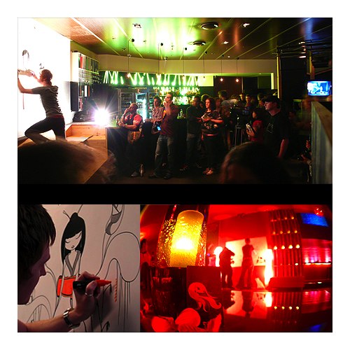
Last year I held a solo exhibition ‘Perpetual Kagemi’ in Melbourne. It was so great to have such a huge turn out and positive response to my work. Collaborating with Coothwork to film the show was also a great experience for me; Coothwork did all the filming and editing, I did the music, and character animation and special effects.
What does the typical day of ‘Skaffs’ involve ?
There really isn’t a “typical” day in the world of SKAFFS. It tends to be very chaotic. I start early and I finish late; I don’t ever stop thinking even when I go to sleep. I’m always working on something whether it is tight time frames for commissions, working on artwork for exhibitions, finishing up SKAFFS related projects or collaborating with companies to produce product lines. I do a lot of speaking engagements and live paintings so I am very fortunate to travel a lot. I’m also currently working on my own animation series. Having to oversee the production has been both challenging and exciting.
What will be new for SKAFFS in 2009?
2009 is going to be another busy but awesome year! I will be doing a lot of artist signings and live paintings to launch the limited edition book “Chaff n’ Skaffs: Mai and the Lost Moskivvy”. In 2008 I completed a music band CD slick and there is talk of appearing live at one of their music events (unfortunately I cannot disclose any further information at this time). I have numerous exhibitions in San Francisco and Los Angeles. And most importantly, I continue to develop my SKAFFS product line through collaborations with other progressive companies. In the next couple of months I will be launching a new line of giant vinyl adhesive artwork, some iphone apps and hopefully an animation by the end of the year!
What are your other interests beside art and design?
I tend to do a lot of traveling. With the long hours that I generally work (mostly in front of a computer) I try to balance it with some Taekwondo and when I have some spare time I also like to do skateboarding or blading.
Any advice to up and coming artists and designers?
My advice to aspiring designers would be to establish a style, practice, and stick with it. Experimenting with different mediums will help you to define who you are as an artist. And get involved in the local community and start exhibiting to get your work seen.
SKAFFS latest limited edition book “Chaff n Skaffs: Mai and the Lost Mozkivvy”
Mai is a young girl who never ventured too far from her home. When a lost mosquito interrupts Mai’s sleep, her friend Chaff suggests they escort Moskivvy back home to a faraway land. So begins a courageous girl’s voyage into a fantastic world that will kindle readers’ imaginations. Encountering whimsical creatures along the way, this trio must travel over land, sea, and sky.
Desktop Magazine describe Chaff n’ Skaffs: Mai and the lost Moskivvy as “the perfect conduit for Feldman’s imagination combining his waif like lasses and charming characters with the beautiful, yet unpredictable realm that is the unique Australian environment.” Discover a world of visual delight that Flavorpill described as a “childlike wonder and crisp exaggerated colors” and a new brand of heroine!
“Feldman’s artwork blends the classic stylings of 1950s Disney with a modern design sensibility to create something both cutting edge and timeless.”
-Andrew Farago, Cartoon Art Museum, Gallery Manager
“Luke Feldman’s instantly recognizable ‘Skaffs’ creations comprise a heady mix of bright colors and razor sharp style mixed with an underlying, almost tangible naivety that make his illustrations easily identifiable in a world where originality is not as easy to find as you might think..”
-Jo Spurling, author and editor of Desktop magazine
“As you follow the adventures of these three intrepid voyageurs, you can’t help but fall in love with the dazzling hues, exotic animals and intriguing storyline that splash the pages of this book.”
- Rossella Frigerio, editor, Chic Today
What was the inspiration, style, highs and lows of working on this project etc. I have been illustrating for children’s books for a few years now, working for various international publishing houses. It was always a passion of mine to get my very own book published. The Chaff n Skaffs series had been in the workings now for a few years. The characters, designs and storyline had been sketched out prior to meeting with San Francisco based publishers, Immedium . What I have enjoyed about working with Immedium is that they allowed me to have complete creative control. This meant I could use many Australian elements and lingo in the book and create each page as a finished piece of artwork for all to enjoy.
My use and choice of colour is extremely important and therefore there was a lot of communication between the printers and myself. Variations in print can occur between all print companies so I have become accustomed to being on top of the problems that can occur.
Publishing a book is definitely a long term project. You must be passionate about the concept to work on it for long periods of time. Find a good publisher, one that is supportive and in control of the printing and distribution.
When/where can we get a copy of your new book?
The book is available online at www.skaffs.com/chaff and worldwide at Borders, Barnes and Noble, Target, Amazon and many independent stores such as Villain Store and Robio in Melbourne, VIC. It ships in April 2009.
$15.95 USA, Children’s Picture Book ISBN: 1-59702-013-3 (ISBN 13: 978-159702-013-8) 10 x 9 3/4, 36 pages
This weekend I had the opportunity to visit some friends in NYC. Knowing my passion for Interior Design, my friends all love to try to take me to the most inspiring spaces they can find. One such place I had the delightful opportunity to visit briefly was Highline in the Meat Packing District (Little W. 12th Street).
The Highline website describes itself as a combination of restaurant (Thai-fusion cuisine), bar, and lounge which is named after the old elevated rail structure on Manhattan’s West Side, the High Line. Additionally, the ambiance is themed around a luxury on-board dining experience with the decor attempting to evoke a cruise ship feel.
Although this chic restaurant and lounge has been open since summer of 2004, I still felt immediately tranced by its relevant, modern decor. I am not quite sure where “luxury cruise ship” falls into the design of this space, but, the sophisticated white walls and a three-story waterfall do complete a truly unique design. A space that makes you feel like you stepped off the streets of NYC right into a hip, South Beach hotel lobby.
Published on March 17, 2009 9:32 am.
Filed under: design
I found this in my extensive internet travels the other day — An extensive Mid-20th Century European advertising poster collection… Here are just a few of the hundreds from the gallery
These bold, simplistic graphic posters are a continuous source for contemporary artists and illustrators.
Via the website of Illustrator and Designer Bob Staake
Published on March 15, 2009 11:42 pm.
Filed under: art
You may remember an earlier post by Henry on the work of Maria Yasko – when he had a look at the Modular Shelving Unit –
– Beautiful and clever pieces by young, Russian, industrial designer Maria Yasko. Yasako suggests that her piece, “Snow bird” is a blank/canvas. When placed in the hands of a designer, artist, or any adult or child for that matter, “Snow bird” acquires a completely new image every single time. You can take a felt tip pen or a box of paints, reimagine it as you wish and transform it’s simple white canvas into a small work of art. It is up to you to decide whether it is going to be a shelf or just a bright spot in your interior design.
winter bird by Maria Yasko
Published on March 14, 2009 3:52 pm.
Filed under: design
Dale Chihuly is a glass sculptor from Tacoma, Washington.
I’ll admit, I’m far from an expert on glass sculpting and what these artists are capable of.. but what Dale Chihuly magically creates with glass is really something astonishing..
I am going to share with you a number of pieces from Chihuly’s 2006 exhibit at the New York Botanical Gardens. Though there are a number of newer and current installations worth checking out.
What I found most interesting in my research, was the knowledge that Chihuly no longer actually works on the glass himself. After being in a head on collision and losing an eye and dislocating his shoulder in a bodysurfing accident, Chihuly was no longer physically able of creating the likes of the following masterpieces. Instead of finishing his career there, he hired others to do the work.
“Once I stepped back, I liked the view” Chihuly describes his role as “more choreographer than dancer, more supervisor than participant, more director than actor.”
Needless to say, Chihuly’s grasp of the glass and its limitations is amazing. His sculptures can be so fluid, full of movement and energy, but he also has the knowledge to make the material more mellow and somber.
Chihuly has dozens of installations and examples of his talent along with some great videos of the process at his website
Much has been written about McMansions and their generally detrimental effects upon the residential landscape, aestheticism, and most importantly the environment. With this in mind, it was most refreshing to stumble across Brad Kittel’s work at Tiny Texas Houses.
Kittel designs and build tiny houses – the largest so far being about 4 x 9 metres – through ‘Salvage Building’. Owners can choose from an enormous supply of salvaged doors, beams, and other fittings, to create a perfect tiny dwelling. They are then trucked from Texas to the owner’s property.
Often the tiny houses go over several storeys and incorporate lofts, higher levels and porches. While they are seriously tiny (although no worse than many student apartments in Melbourne!) they look gloriously cosy and seem to have everything you’d need.
I soon learnt that the colourful display was not in anyway random, but instead was loosely based on the age old concept of the golden rectangle
Here are Rebecca’s thoughts on the installation.
“When I began investigating the Box13 space, I wanted to plan my installation according to the laws of the golden rectangle.The aerial view of the staircase seemed to have a shape that would work with the golden spiral. Ultimately, it was too difficult to make every piece of tape and every linear gesture adhere to the very specific laws of the logarithmic spiral, but I think the end result still has its basis (somehow and somewhere) in phi. I guess I kind’ve ended up making my own rules about balancing proportions in a rectangular space.”
A huge thanks to Rebecca for sharing her thoughts and work with us.
For more information and equally stunning installations visit..
“In an age with tons of artificial things around us, I feel many people desire to have real things that provide them with experiences from nature.”
Fluoflo, 2008
Originally studying to be an Architect, the Japanese industrial designer who goes by the alias ‘Nosigner‘ clearly found his calling beyond the composition of a building. Nosigner has been recently featured in all the latest design shows and magazines – getting rave reviews for his forward thinking installations and product designs. The works created by the designer has a flowing theme, using nature as the inspiration behind his projects. The use of nature is just part of Nosigner’s overall goal to increase awareness on global issues relating to the environment and waste.
The origination of the name ‘Nosigner’ and and in-depth discussion of his projects was featured in an interview for this months issue of Metropolis. Check out the article here.
Spring Rain
Pokkari, 2007
Luminaire composition of feathers.
Rebirth, 2008
Luminaire composition of hollowed egg shells.
Published on March 7, 2009 10:12 am.
Filed under: design